
Cool pixel art of the hypixel logo
-

I made this a really long time ago in 2024.
My artstyle has only gotten worse since then /hj
-

@unpaidintern wowwwwww cool i love it i never could do pixel art how do u do it
-
 gl1tch is gay integrity TOBI CULT !Spooky Fan! | Okay legal adult Dizzy certified<3 Wants to be a pet ☆ Bring BDNS back! Might Your All With Yourself Be | Good boy loser | Heel gifi </3 Everyone Edits BANNED Gl1tch staff Snail Mail fan-club Gl1tch fan club Snail News Staff! No BIRTH IN SB News rip wall sweetpuddin pale as F∪CK The Living Tombstone Spawnist Chud YI XI!! #1 kinger fan Belt to ass i never sleep at night "Screw you guys, I'm going home @Everyone chronically online Murder Drones Fans Kind people ₊˚⊹౨ৎ ₊˚⊹ Undertale Fans! ♥♡♥♡♥ The OG FNaF fans ☆ MHA IMA BURN IN HELL, but<3 i ♥ weezer Hide BDNS Ads Nintendo Switch Users Unfunny `Gravity Falls` Gang
looks the Same also this is cool
HAIII IM GL1TCH! My pronouns are he/him ☆
green: talk to me
yellow: I’ll be back in a little bit
red: fucķ off I’m having a bad day or I wanna be left alone but snail mail and lil_sillyz can message me also my DM’s are gonna be off
gray: offline -
looks the Same also this is cool
@Femboy-Gl1tch
thx
-
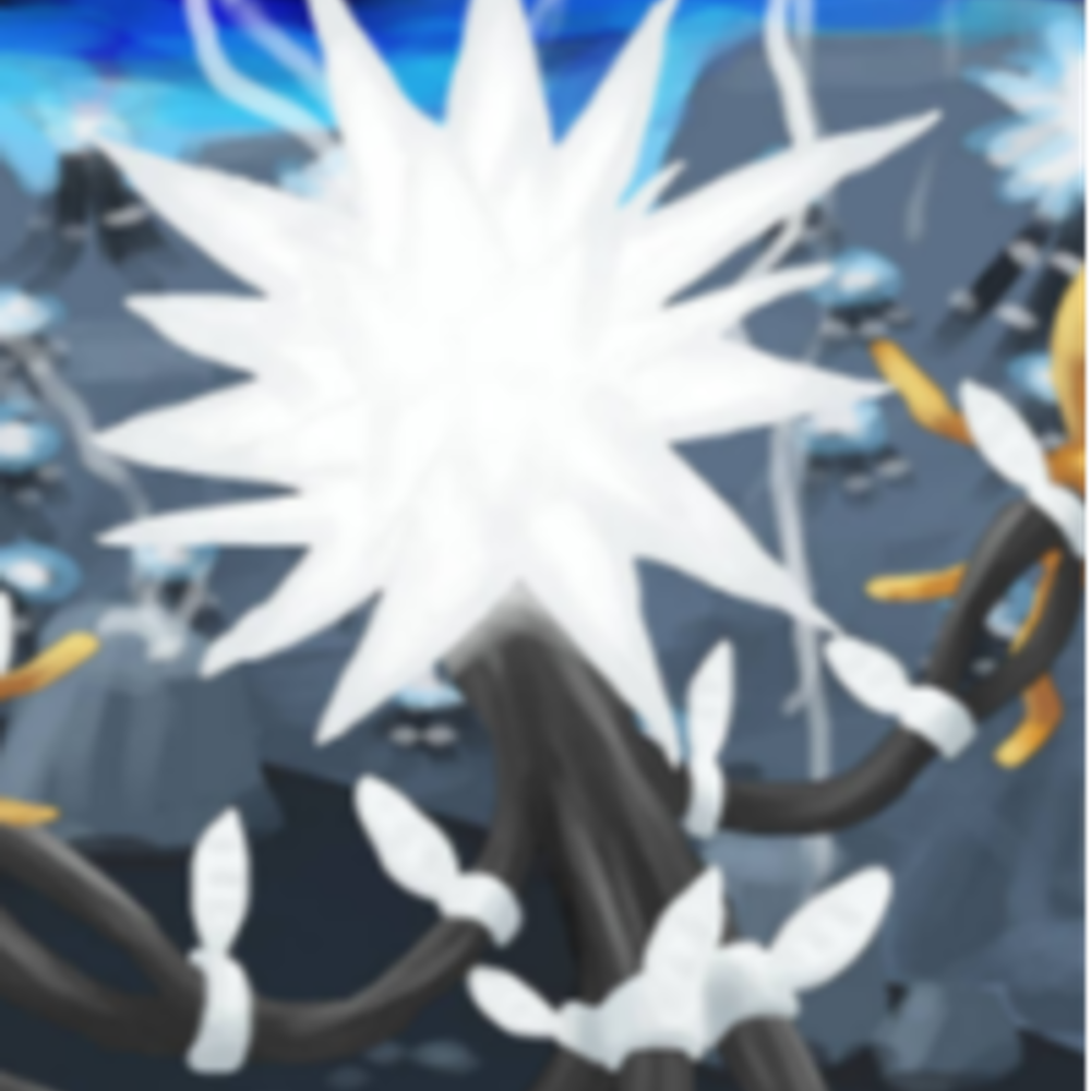
I'm playing spot the difference gang
Hear me out, lisbeth the blacksmith
-
I'm playing spot the difference gang
the old version looks kinda goofy (i can list specific differences but it's more fun to let other people look at it)
deltarune tomorrow
-
the old version looks kinda goofy (i can list specific differences but it's more fun to let other people look at it)
@UnpaidIntern OMG I SEE IT NOW!!!
Hear me out, lisbeth the blacksmith
-
@UnpaidIntern OMG I SEE IT NOW!!!
In the old version, the shading on the left side of the H is less intense and inconsistent with the right side of the H. This caused the perspective to look kinda goofy.
In the new version, the shading of the left side of the H is more intense and consistent with the right side, it fixes the perspective of the H and i think it looks a lot better. For some reason I also changed some of the lighting/highlighting/pixels in the middle, ig it looked cooler to me in the moment.
deltarune tomorrow
-
In the old version, the shading on the left side of the H is less intense and inconsistent with the right side of the H. This caused the perspective to look kinda goofy.
In the new version, the shading of the left side of the H is more intense and consistent with the right side, it fixes the perspective of the H and i think it looks a lot better. For some reason I also changed some of the lighting/highlighting/pixels in the middle, ig it looked cooler to me in the moment.
-
@unpaidintern wowwwwww cool i love it i never could do pixel art how do u do it
wow this reply got queued so badly lol i didn't see this for like a day
tysm
There's a bunch of pixel art tutorials on youtube that are really good. I used those for the most part to learn how to do it.
I also actually just used a reference of the hypixel logo here, and just kind of rebuilt it by tracing (but not in a evil way, it's similar to rotoscoping) over it with pixels that matched the overall colors of the higher-res reference. Then I polished it to keep more important details, and ended it by just ignoring the reference entirely and just made it look better idk
I remember this surprisingly well considering it was two years ago
Hello! It looks like you're interested in this conversation, but you don't have an account yet.
Getting fed up of having to scroll through the same posts each visit? When you register for an account, you'll always come back to exactly where you were before, and choose to be notified of new replies (either via email, or push notification). You'll also be able to save bookmarks and upvote posts to show your appreciation to other community members.
With your input, this post could be even better 💗
Register Login